

Creative Brief: The MSNBC Rebrand [CONFIDENTIAL]
A Corporate Death Rattle Rendered in Pixels Instead of Phlegm

To: Inept-Yet-Obscenely-Compensated NYC Branding Agency
From: John Allen Wooden - Chief Creative Officer, Brand Necromancy & Identity Shuffling, COMCAST Corp.
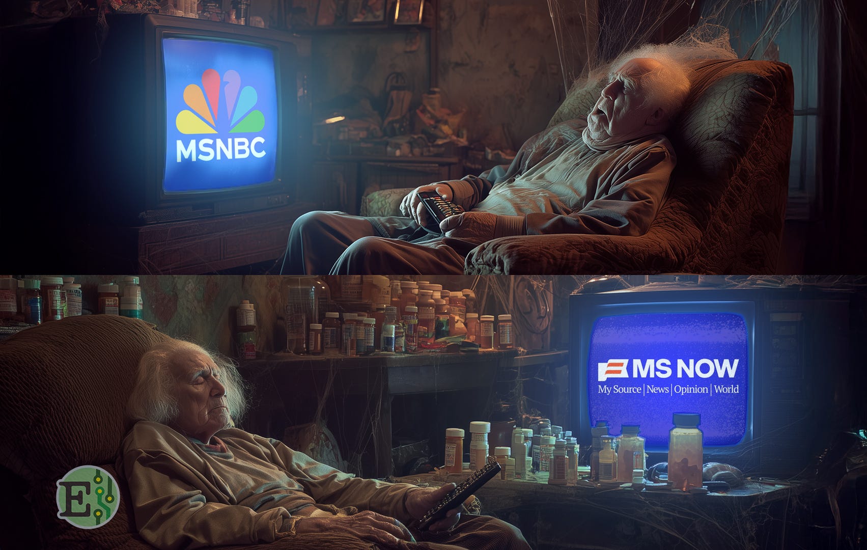
Background: MSNBC is a legacy news brand launched in 1996, brilliantly fusing Microsoft’s boondoggle AOL-wannabe “MSN” dial-up Internet service with the “NBC News” division of noted toaster manufacturer General Electric.
Status: In July of 2025, this “mass media” national outlet averaged 81,000 primetime viewers aged 25-54—or nearly half the print circulation of the Sunday Fresno Bee. Total average daily audience is 530,000 viewers, or roughly 0.0075% of a YouTube CocoMelon Nursery Rhyme Short.
Re-Branding Goals:
Retain the posture of an ultra-relevant, “premium” brand that wields enormous cultural influence—despite the reality of having withered into the Sears Catalog of News.
Attract a 10x larger, 4x younger audience while not alienating even a sliver of our core viewers: recliner-bound geriatrics who are only still watching in glassy-eyed stupors because the remote control batteries are dead.
Target: Officially, Adults 25-54—but really anyone with a pulse and one semi-functional eye. Also, their cats.
Tone: “Born-Again Americana”—or whatever “brand essence” BS we need to peddle at Upfronts to keep charging cartoonishly inflated ad CPMs.
Brand Promises:
Fighting vacuous right-wing tribal rage porn propaganda with vacuous left-wing tribal rage porn propaganda.
A hunky-dory place to watch ads for cancer drugs and denture tablets.
±5 hours a week of affably snarky commentary from that whip-smart lesbian in the hip spectacles (until she decamps to TikTok when her contract expires).
REQUIREMENTS:
Logo/Iconography: MUST INCORPORATE AN AMERICAN FLAG! But not an obvious one—because overt patriotism is cringe. Ideally it’s abstract enough to get confused with a melted piece of striped peppermint hard candy that grandma spit onto a napkin for a minute while she takes her Oxybutynin.
Identity:
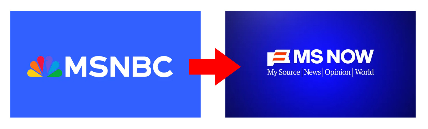
Eliminate “NBC”, But Retain “MS”—Forget that >90% of our viewers remember that the “MS” means “Microsoft” (which divested this turd 13 years ago); Corporate Strategy has concluded that attempting a memorable all-new brand is too risky, and the best we can realistically hope for is triggering isolated flickers of cognitive dissonance.
Incorporate “MY” Somehow—either in the wordmark or tagline. Because our boomer CMO still smokes branding crack from the MySpace era, when everyone from Yahoo! to Coke to Verizon slapped a “MY” on their websites, confident that consumers would respond like cowbird chicks imprinting on Furbies.
Typography (Primary Word Mark): Use Helvetica, because the COO saw a 2007 documentary about how that font is totes de rigueur for anything with aspirations of modernity or intelligence. NOTE: If not actual Helvetica, then Gotham or some other ubiquitously soulless sans serif – he can’t tell the difference anyhoo!
Typography (Tagline): Any old-timey newsprint-style type will do. This will be our perfunctory and cynically ageist aesthetic olive branch to the 97% of our audience that’s so ancient, they once banged out resumes on Smith-Corona typewriters. LOL!
Color Palette: MUST USE SATURATED RED, WHITE, AND BLUE! Focus groups confirm that three decades of conservative media hammering MSNBC as “Commie-Libtards-R-Us” has been devastatingly effective, so lose the fruitcake pride parade rainbow colors pronto! NBC can keep its peacock—and hopefully get pecked to death by that garish albatross…
Competition: Other dinosaurs shuffling toward the tar pits, including CNN but especially FOX NEWS, which despite pulling numbers 3x higher than ours, is still also just cable news—an imploding anachronism consumed overwhelmingly in a few thousand nursing homes & hospice centers.
Notes:
Ensure logo is optimized for legibility on cable boxes last manufactured in 2003.
Must test well among male viewers with benignly enlarged prostates who think podcasts have something to do with fly fishing.
FINAL HIGH-PRIORITY NOTE: Retain copies of all MSNBC branding assets! There is a 57.2% likelihood that we will re-pivot back to current identity/branding/logo/etc. by Q1 2027.
About John Allen Wooden:

Howdy. I’m a satirist, creative director, and dad based in Los Angeles. Having done hard time in big online media, ad agencies, late night TV, politics, and parenting, I created Epostasy as my little lab for gleefully dismembering all those tediously self-important things. You can check out my latest kids book, The Liking Tree: A Kids & Social Media Fable, along with other shenanigans at johnallenwooden.com